This illustration was a commission for a wedding program. The clients, Jon and Ken, hired a couple of artists to do different versions of the cover of their wedding program, in the vein of comic books "variant covers", a publishing gimmick that's become very popular in recent years.
I was tasked to do the "Ken version" of the program. Ken is a big Stephen King fan, so we built the idea for the cover around Stephen King books. We had a couple of talks about his favorite King novels, elements from the stories and their adaptations to other media, and visual gags that could be incorporated into the illustration.
I was tasked to do the "Ken version" of the program. Ken is a big Stephen King fan, so we built the idea for the cover around Stephen King books. We had a couple of talks about his favorite King novels, elements from the stories and their adaptations to other media, and visual gags that could be incorporated into the illustration.
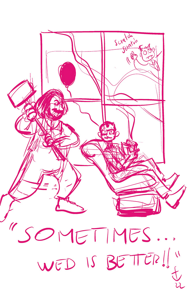
There are several elements from King's stories in the illustration - For starters, the couple themselves. In the novel "Misery", psycopath Annie Wilkes kidnaps her favourite writer, Paul Sheldon. At some point in the story, she keeps him from escaping by breaking his legs with a mallet.
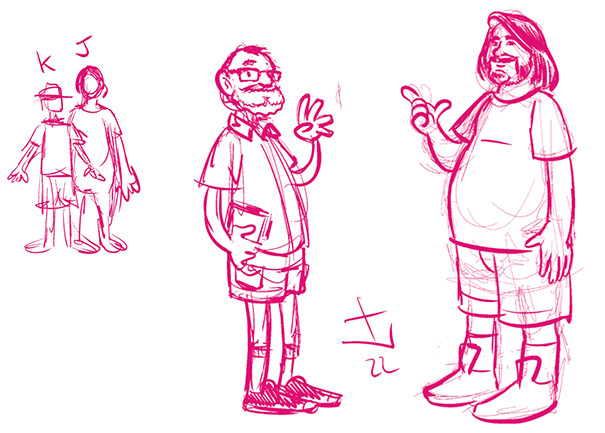
So we played with that idea by having Jon dressed as Annie and Ken "playing" the part of Paul on the illustration. The floor is covered in the carpet of the Overlook Hotel, from "The Shining", the vampire child scratching the window, from "Salem's Lot" and the red balloon and clown from "It". Also, Ken is reading "Dead Zone", his favorite Stephen King novel.
As a final gag, the corner box on the top left of the image features a bloody crown and a scepter, as a reference to "Carrie".


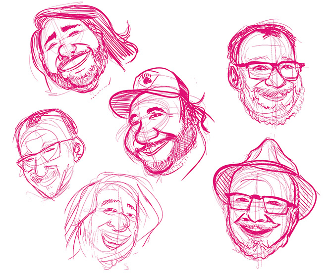
During the talks with Ken, the idea for the title of the program came up - "Sometimes, wed is better" sprung from a famous line from the Pet Sematary novel, "Sometimes, dead is better". Once we had nailed the concept, it was a matter of getting the grooms likenesses right and defining a layout for the illustration. The illustration was used in the program cover and also as a poster at the wedding venue, and the clients were really happy with the end result.
Photo by Ken Creamer